Just like the Fashion World, the World of Interior & Industrial Design also revolves around color trends. Manufactures look to Pantone for trend forecasting in all facets of design and manufacturing. Known for their forecasting ability, Pantone monitors the color pulse of the world including emerging trends in all avenues of design.
Color is the catalyst that can define space, set a mood, and many times create magic. Use of color does not always have to be in bold stokes. Adding accents and touches can infuse your world with style and color without being overwhelming. The design industry has an age-old adage – “You can always add but you cannot take away”.

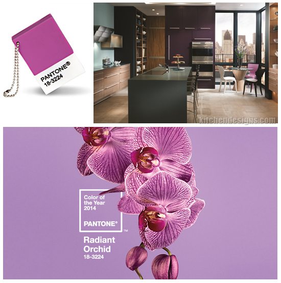
In 2014 Radiant Orchid defines this years color trend — a royal and regal color, the color of Royalty, and synonymous with great joy, love and health.
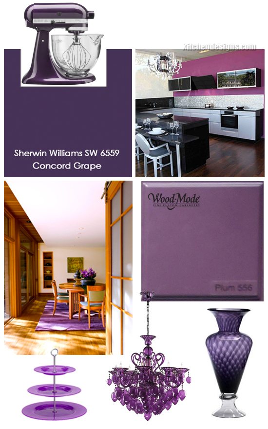
Take a look at this years trend from broad strokes of color like Concord Grape (SW 6559) from Sherwin Williams, Wood-Mode’s Plum #556 cabinet finish for a striking accent wall, wool area rugs to define a space and KitchenAid’s Stand Mixer in Boysenberry to wake things up in the kitchen. Accenting your home with accessories is a great way to add a pop of this year’s Pantone’s color of the year!

…Mario J. Mulea, CR – KitchenDesigns.com


