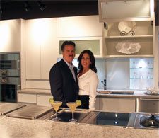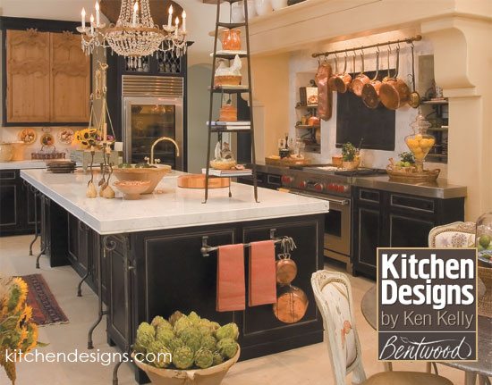
French Country Kitchen in Bentwood Cabinetry features the sink on the island facing the room with the range behind the prep sink.
Kitchen Layouts: Over the course of your lifetime, you’ll spend in a lot of time in front of your sink. Where you place that sink and its size is quite important. If you have a spectacular view out your kitchen window and enjoy looking at nature, you might prefer your sink be placed along the outside wall. If you love to socialize while looking at your beautiful new kitchen, you might want to consider placing the sink on the island facing into the room. If you have room for both – all the better! Keep in mind, your designer will discuss several efficient design options that work for your lifestyle, and those options will depend on the kitchen size and other variables within your space. (Thus the importance of calling in a pro!)
What I have in my own kitchen works amazingly well, but a lot of people don’t understand this concept at first. In my kitchen, one of the sinks is on the island and the oven is directly behind me along the back perimeter. I have ample counter space on each side of the sink for food prep and even more counter space on each side of the oven. I can’t tell you how convenient it is to simply turn around and go back and forth between the sink and the stove, which a lot of people object to because they just don’t understand how well it works until they actually work with it.
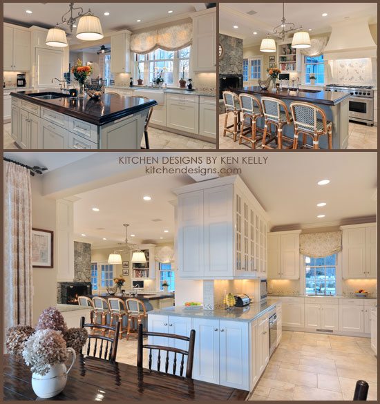
Designer: Ken Kelly, CKD, CBD, CR – In this Oyster Bay Cove home we included three sinks. One by the window, one on the island with the range behind, and one in the buttler’s area
Some of the best kitchen layouts tips: The area between the sink and the stove is where 85% of all work in a kitchen is going to take place. We have seen kitchens that make the mistake of squeezing this important work zone into a small area, yet they have an enormous run of countertop space at the other side of the room. Well guess what? It is irrelevant that you have all that other countertop space. You don’t actively use that countertop space. It just collects things that get dropped there — usually items that don’t belong in the kitchen in the first place. It is all about designing the kitchen space so that you’re effective to work.
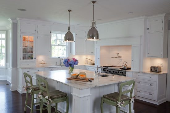
Designer: Ken Kelly, CKD, CBD, CR – In this Hamptons-style kitchen we placed the main sink in front of a window with a gorgeous view and added a smaller prep sink on the island
We know this from looking not only at all the jobs we’ve done but also all the jobs that we rip out. We look at people’s old kitchens and will see a kitchen with a mile of countertop space. Then, we’ll look over and see that the sink and the stove are about two feet apart, and that countertop space (the old formica top) is worn completely through. The other side of the room with the “miles” of countertop space is brand new. It’s human nature; we trot along the path that requires the least amount of steps.
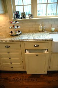
Designer Ken Kelly, CKD, CBD, CR – Cold Spring Harbor, NY -Garbage Pullout
We see it over and over again. Trust us; we know you’re going to use this area the most, so when we design your kitchen, we need to make this area comfortable and give you the right amount of inches in between — ideally somewhere in between 30 and 48 linear inches right to left. You can go on the smaller side if it is an island because you’ll have more depth on the island. Next to the prepping sink, you need to be able to unwrap and throw away garbage, so place your pullout garbage next to the sink.
Alongside your sink, you’re going to need counter space on both sides. You DON’T want the sink all the way to the edge of the island. People always want to put the sink on the edge so they have a big open space. Well, you get the open space, but what people don’t realize is that when you’re splashing at that sink, the water is going over the side of the counter, down the side of the cabinet, and onto the floor. You’re always splashing at the sink. You need to have more room and move the sink away from the edge –at least 18 or 20 inches to make it more effective (preferably toward the middle). You’ll still have plenty of room on an island for countertop space because what you can trade is width for depth. Meaning that, because it is an island, you’re not limited to hitting the backsplash wall. You can push something further away from you, so you don’t need as many linear inches to still be very effective because you have more depth to work with.
We often have clients request that their island be perfectly smooth and have nothing on it. They think that this type of blank slate will be better for parties and displaying food buffet style. Design-wise, we disagree with them. We believe it is ideal for the sink to be on the island (or one of the sinks). During parties, another great use of that sink on the island is using it as a large ice bucket, filling it with ice, wine, beer or soda cans. If a client raises concerns about the dishes being left out, we often recommend putting in a second dishwasher. You’ll have a small additional plumbing and electrical expense, but a second dishwasher hardly costs any more money than putting in a cabinet. In kitchens with enough space, we highly recommend two dishwashers. With two dishwashers there is always room to put everything away so nothing is left on the counters unless, of course, you have a monster Thanksgiving party where you have to run more than two dishwasher loads to finish everything. Still, even with one dishwasher, this design works fabulously well.
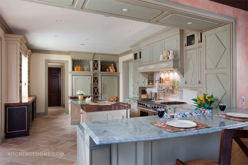
In this French Country kitchen, we added a drink sink into the island bar. Click photo to see the post about this kitchen.
Size does matter! Some people prefer their sink to have one large single-bowl, while others like a double or even triple bowl. Whatever style you choose, be sure your plates and pots fit the sink size you choose. Many sinks come with fitted custom accessories that our clients enjoy such as fitted colanders, cutting boards, and grid racks. Some of our clients have also installed an in-counter compost systems next to the sink. (See Blanco’s Solon system here).
See our kitchens we featured in this post: French Country, Hamptons Style, Elegant White Estate Kitchen
![]()
Kitchen Designs is an Amazon affiliate and makes a small commission if you make a purchase | Kitchen Designs by Ken Kelly, Inc., Showroom locations: 26 Hillside Avenue, Williston Park, NY 516-746-3435


